How to Design Visuals That Educate Without Overwhelming
Carlyn M., Multimedia Artist
January 23, 2026
Total Feedback Counter
0
14
I used to believe that great design was about stopping people in their tracks with something beautiful. I measured success by how “cool” the layout looked or how trendy the fonts were.
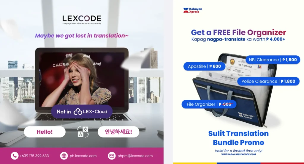
But that changed when I started creating design that tell a story, educate the viewer, and help people understand. When I began working with content for certified translation services and visa requirements, I realized something important: When clients are worried about their papers, clarity is the greatest help I can give.
Whether it is a business owner expanding overseas or an individual rushing to meet embassy requirements, the people looking at my designs are often anxious. They aren’t looking for a work of art to admire; they are looking for a solution to their problem. If my design is cluttered or overly complicated, I am not just making a bad graphic. I am ignoring their needs.
Here is how I learned to design with empathy, educating without overwhelming.
1. The Art of Respecting Time Subheader
We live in a noisy world. When someone searches for document translation, they usually need it as soon as possible. They don’t have the luxury of time to decode a complex image.
I learned that being “thoughtful” means being direct. Instead of trying to impress them with abstract visuals, I now ask: What is the one thing they need to know right now?
If the topic is translation for embassy appointments, the design shouldn’t be a maze. It should be a map. It should guide them from “confused” to “informed” in seconds.
2. Simplicity is a Form of Kindness
There is a lot of legal jargon in certified document translation. It is easy to fall into the trap of cramming every single rule onto one canvas.
But I discovered that white space isn’t just “empty” space—it’s breathing room. By stripping away the decorations and focusing on clean typography, we help the viewer feel calm. We make the daunting task of understanding translation for documents feel manageable.
A clean design tells the viewer: “We have this under control. You can relax.”
3. Visuals That Build Trust
When you hand over your personal history or your company’s contracts for certified translation, you are taking a leap of faith.
Design helps bridge that gap. I stopped using loud, chaotic colors that scream for attention. Instead, I use consistent, professional layouts that whisper reliability. The design itself becomes a promise that we will treat your documents with the same care and precision that we put into our visuals.
Art is vital to our lives. It inspires and moves us. But in the world of service, clarity is the ultimate form of art.
My goal now isn’t just to make something that looks good. It is to create something that does good. By making the complex simple, we help businesses grow and families move forward.