Freshten R. |
October 01, 2024
When I first joined the Lexy App project as a front-end developer, the mission was clear: to revolutionize how people learn languages by leveraging the power of AI. Lexy is an innovative AI tutor website application designed to help people learn English. When I came on board, I was thrown into the mix with exciting technologies like Ionic for front-end development, Firebase for our database, and Python for back-end development. It was a bit overwhelming at first, but it’s been an incredible learning experience.
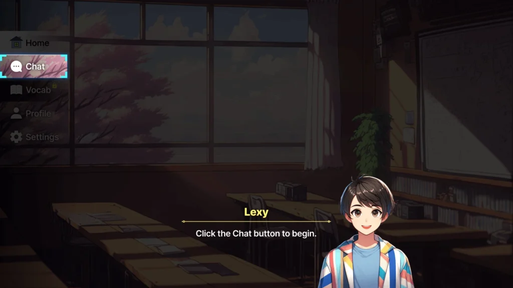
One of the first things I tackled was understanding React and how it integrates with the Ionic setup. This was my first deep dive into Ionic React, and I quickly learned that it’s a powerful tool, albeit with its own set of quirks. I started by working on the tutorial page feature for Lexy, where the challenge was to create a seamless and engaging experience for users who were just getting started with the app.

The idea was to guide users through the app’s features and maximize their experience, so I designed the tutorial page to be both intuitive and interactive. I needed to ensure that the tutorial content was clear and that navigation between different sections was smooth. I thought I had a solid plan, but when I put everything together, it didn’t feel quite right.
One of the biggest challenges was ensuring all the elements worked together seamlessly. Integrating the animations with mobile responsiveness and ensuring that the tutorial page, which teaches users how to create custom animations, was both functional and visually appealing required much coordination.
I spent many hours debugging and refining the details to ensure everything worked smoothly. It took a lot of trial and error, with plenty of mistakes made along the way, but I learned so much about user experience design (UX), the importance of responsive design, and how keeping things simple and intuitive is crucial for mobile app development.
I thought I had a good grasp of CSS, but once I started working with media queries and responsive designs, I realized I still had a lot to learn. My first attempts at making the app responsive were pretty rough during development. Elements would shift in weird ways, texts would get cut off, and the whole layout would break on smaller screens. I remember feeling so frustrated because I couldn’t figure out what was going wrong.
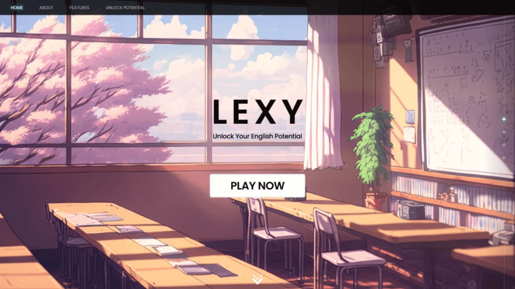
Next, I focused on designing the landing page, which is crucial because it’s the first thing users see. I wanted it to be welcoming and informative, showcasing what Lexy is all about. This involved not just laying out the information effectively but also ensuring that it was visually appealing. I spent a lot of time working on the layout, colors, and placements of elements to make sure the page was both functional and attractive.

A significant part of this task was making sure everything was responsive. I had to dive into CSS media queries and ensure that our pages looked good on different devices and screen sizes. This meant testing on various devices and seeing the layout to make sure it was both functional and visually appealing across the board.
I was super excited to implement all these cool features, such as smooth scrolling and interactive buttons, but I quickly ran into a wall. My animations were lagging terribly, and the page wasn’t responsive at all. I remember the first time I loaded it on my phone—it looked completely broken. Buttons were overlapping, texts were out of place, and images were way too big. It was a total mess. Once again, it took a lot of trial and error, but seeing the results come together was really satisfying.
Animation was another area in which I spent a lot of time. We wanted to add some flair to the app to make interactions more engaging. I learned so much while experimenting with animations for button effects, transitions between pages, and the appearance of elements on the screen. It was fun to experiment with different styles and effects, but it also meant dealing with performance issues to ensure that the animations didn’t slow down the app.
I had to step back and breathe for a while and figure out what was going wrong. I realized that I was trying to add too many codes for animations and transitions without fully understanding how they would affect performance. So, I went back to basics. I refactored my code, stripped down the page, removed unnecessary animations, and focused on making the core elements work correctly. I also spent hours reading through documentation, watching tutorials, and experimenting with different solutions.
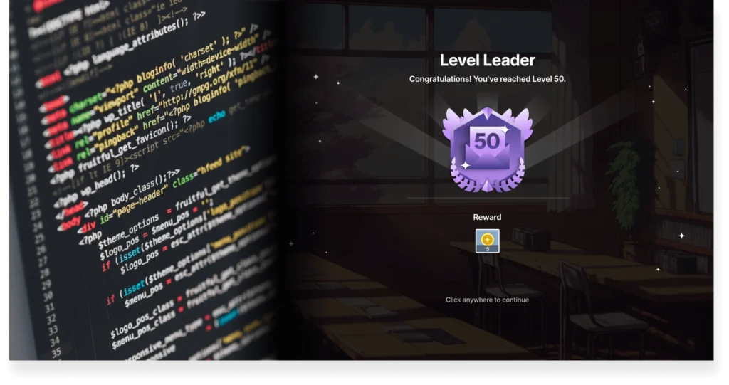
The next Lexy-related task for the second half of the year was the implementation of critical features like the badge reward system. The badge system was a core part of Lexy’s engagement strategy. The idea was to motivate users by rewarding them with badges as they progress through different levels and challenges in the app. It was a daunting task, especially for someone still getting the hang of the complexities of Ionic and Firebase, but I was eager to dive in.
I started by understanding the user flow and specific actions that would trigger badge rewards. For example, users could earn badges for accomplishing a certain number of correct messages or learning a set number of new words. I also worked closely with the UI/UX team and exchanged ideas for visually appealing and highly intuitive designs.
The implementation was not without its challenges. One of the biggest hurdles was ensuring that the badge system was seamlessly integrated with Firebase. For this, I had to write efficient codes to handle real-time updates whenever a user earned a new badge. This involved setting up Firebase triggers and functions that would automatically update the user’s badge collection and reflect the changes in the app without any lag.
Another hurdle was managing data synchronization between the client-side Ionic app and the Firebase backend. Knowing the difference between front and back-end development can be a huge help. Given the dynamic nature of the badge system, I had to ensure that any progress a user made was consistently tracked and updated. This meant dealing with potential issues such as reading spike usage of Firebase and reaching the daily limit.
I also faced a steep learning curve with Ionic. While I had some experience with other frameworks, Ionic’s specific structure and syntax required me to adapt quickly. I spent much time debugging and learning from my mistakes. I had to dive deep into Firebase documentation and figure out how to properly structure our data and set up real-time listeners.
It was a steep learning curve, but eventually, I got it working. Seeing data sync in real time across different devices was like magic, and it felt so rewarding to finally get it right. The support from my team was invaluable during this time. They provided guidance and encouraged me to take on the challenge as an opportunity to grow.
To overcome the hurdles, I broke down the project into smaller, manageable tasks, set daily goals, and focused on tackling one challenge at a time. This approach not only kept me organized but also allowed me to celebrate small wins along the way.

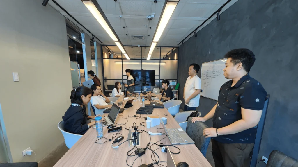
Looking back on my experience with Lexy, I’m proud of what I’ve contributed and learned. As a beginner, stepping into such a significant role was daunting, but it pushed me to grow in ways I never imagined. I’m grateful for the opportunity to be part of this innovative team, and I can’t wait to see what the future holds for Lexy and its users.
My experience working on the badge reward system for Lexy, in particular, has been both challenging and immensely fulfilling. It’s a project that has taught me the value of persistence, teamwork, and continuous learning. I’m eager to keep pushing the boundaries of what we can achieve with Lexy, and I’m excited about all the new features and improvements we’ll bring to users in the future.
That’s been my journey so far with Lexy. Feel free to check out the web app here to see our progress so far. It’s been a mix of challenges, failures, and triumphs, and I’m really thrilled about where we’re headed. Thanks for reading and being part of this incredible adventure with us!
From Bugs to Badges: A Developer’s Journey in Building Lexy App Features